An interactive resource-pull model for reading how organizations actually allocate themselves.
~ 1,250 words. 5 minute read.
Every org has two versions of its priorities. There's the written one: The roadmap, the OKRs, the slide that says "reliability is in the top 3 priorities this year." And there's the one you can only see by watching where money and headcount actually land over several quarters. These two versions diverge slowly, quietly, and almost never on purpose. Nobody sits in a room and decides to starve the platform team (or maybe just parts of it.) It just happens, one planned and unplanned budget cycle at a time, as louder and more visible pressures keep winning the argument.
Now, this is not necessarily a bad thing. Organizations that can turn on a dime to address emerging risks and opportunities could be considered highly evolved, with mature decision structures and fungible teams. This agility may even be a competitive advantage. However, this kind of churn also creates the environment product managers know all too well: Constant recreation of the roadmap, which comes with constant re-education of all stakeholders, explaining why the PI metrics are off, and scanning for the next trade-off. This is a full-time job, with or without AI.
Five places your resources can go
Strip almost any product organization down far enough and its spend can be sorted into five buckets:
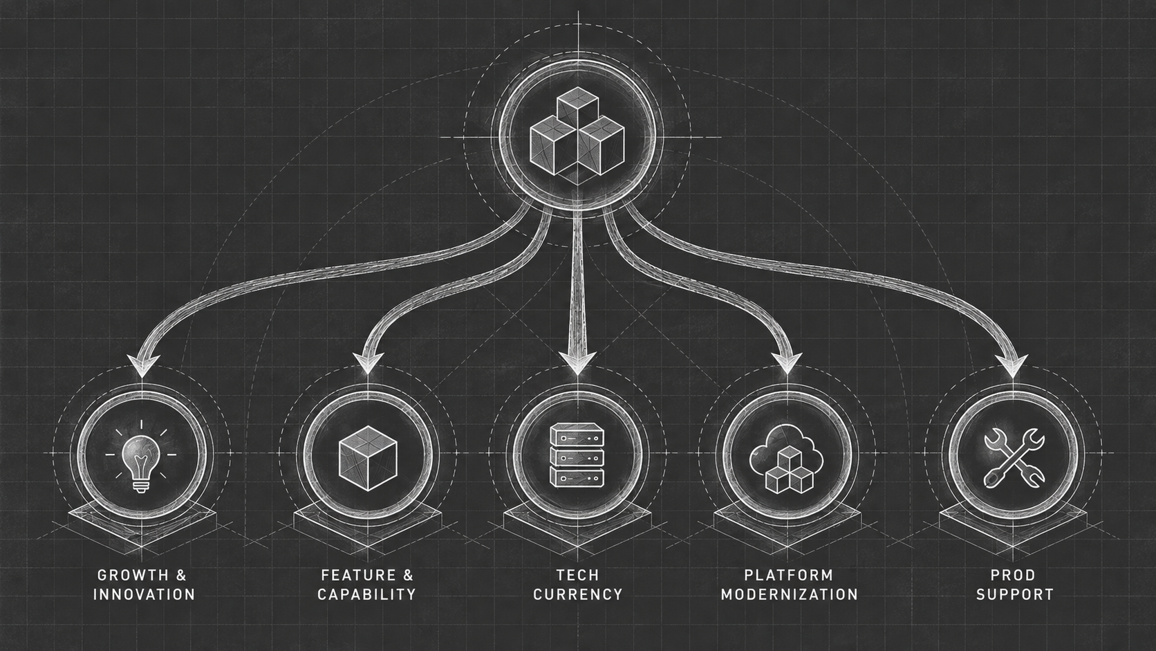
Focus or Spread?
1. Tech Currency
Paying down the accumulated cost of past shortcuts: refactors, upgrades, the unglamorous work of keeping the codebase current.
2. Prod Support
Uptime, incident response, the invisible work that only gets noticed when it fails.
3. Platform Modernization
Time moves fast, nowhere more so than in tech. Your architects probably told you for years now that if this whole thing was built modern, you’d a) be faster to release new functionality and b) the first bucket (Tech Currency) would be smaller. Time to kick off a modernization initiative. Maybe.
4. Feature & Capability
Ahh, finally something people care about: new, customer-visible functionality. The stuff you’ll talk about on stage at the next client event.
5. Growth & Innovation
This is the work you dream of doing, but alas, it often remains but a dream: New bets, new markets, the exploratory work aimed at what the org could become.
Each of these buckets has capacity — how much productive work it could actually absorb if it were resourced to its potential — and a funded level, which is what it actually gets. The gap between the two is where the story lives.
The two forces pulling resources
Layered on top of the five buckets are two outside pressures, and they are relentless in a way the buckets themselves are not:
Market & Competitive pressure
Good product managers maintain a capability matrix that shows how their capabilities perform against those of the competition to help guide investment, build vs. buy, and phasing decisions. This environmental scanning rarely opens the door to more tech currency or prod support projects[1], but usually does invite modernization, feature, and innovation work.
[1] It may, though. A data-leak for example, whether at home or committed by a competitor, might make you allocate resources to tightening up security.
Budget & Talent pressure
Can you even do what you want to do, given who you’re asking to do it, and what you can equip them with? (difficult sentence, difficult question!)
We all live in a world of constraints. Competition for limited resources happens externally and internally. Spoiler alert: As long as humans still make decisions about resource allocation, storytelling remains a superpower.
Neither pressure is irrational. Both are responding to real incentives. That's what makes them so effective at reshaping the org, even when nobody intends to under-invest in the unglamorous buckets, whose story is rarely told effectively.
Legacy vs. Startup: Two Archetypes
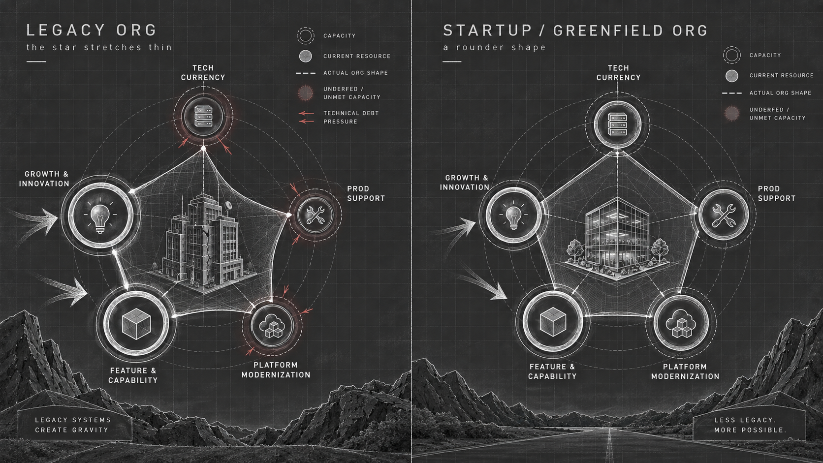
What can you feed?
Legacy orgs: The star stretches thin
In an org that's been running for years, debt usually has a considerable weight of its own. Tech currency, platform modernization, and prod support sit on high capacity, but not by design. Funding tends to be low, because neither external pressure is pulling resources toward them. Meanwhile, they're radiating their own kind of pull: every shortcut makes the next feature slower to ship, which pulls even more urgency toward feature & capability as teams route around the debt instead of through it. A vicious cycle that brings throughput to its knees.
The result, in the model, is a starved corner: three buckets glowing red with unmet capacity while two buckets glow teal, comfortably fed by both pressures at once. The star that traces through all five points stretches thin on one side and swells on the other.
Now that this is visible, it’s easy to realize: This org looks, from the shape of its own resourcing, nothing like its stated priorities.
Startups: The same pressures, a rounder shape
Toggle to a greenfield org and the two pressures haven't gone anywhere. Market and budget still pull toward feature and growth. What's different is that there's no legacy weight fighting back. Debt hasn't had time to compound, so its outward pull is close to silent. Without that added weight in the equation, the same two forces produce a far more evenly funded star. Nobody made a virtuous decision here; the org just hasn't lived long enough to accumulate visible distortion.
What you’re looking at below is not a static diagram. It is fluid in every organization. It isn't legacy orgs that are badly run and greenfield orgs that are well run. It's the same forces, acting on an org at two different points in its evolution, with debt as the variable that decides how far the shape stretches.
Your turn!
If you're playing with the interactive version: the ring around each bucket is its required capacity, the filled disc inside is how much of that capacity is actually funded, and the red haze is the gap between the two, essentially the size of the thing nobody's paying for. The amber arrows are the two pressures actively pulling resources toward a bucket; thicker means harder pull. The short red spokes are each bucket's own outward debt pressure, and the dashed star connecting all five is the org's actual shape, traced live from wherever the buckets currently sit.
Watch the capacity-weighted funding gap number at the bottom as you toggle. That single number is the whole argument compressed: not "is this org good or bad," but "how much is compounding, unaddressed, right now."
Every organization is different, of course. The third tab in the model allows you to draw your own:
Inputs: for each of the 5 buckets, a Funded % (0–100) and Debt (0–100) field, prefilled with the Legacy numbers as a starting example. Nothing redraws until you hit Draw it, per your specs. This may be a helpful visual in your next roadmap planning meeting.
Seeing the shape doesn't fix the pull. But it's a lot harder to keep funding the same corner once you can see what the org actually looks like, rather than what we say it looks like.
Interactive model — Fig. 2 · toggle scenarios below
Build your org's shape
For each function, enter how funded it is relative to what it needs (0–100%), and how much debt pressure it's radiating (0–100). Capacity — how much it could absorb if fully resourced — is inferred: the less funded and more debt-laden a bucket is, the more latent capacity it's carrying.
How to read the field below